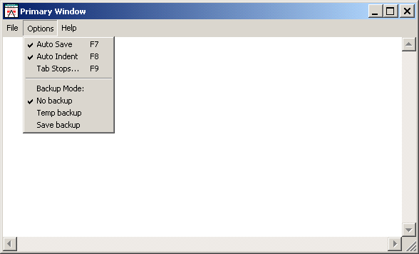
An action bar is a list of options displayed horizontally above a region's window and below the title bar. An action bar is made up of items called pull-downs and buttons.
Buttons appear wherever they are defined on the action bar. Conventionally, buttons should appear to the right of the pull-downs in the action bar.
The items in the left portion of the action bar are called pull-downs. When the text of a pull-down is selected with a mouse, the pull-down menu appears.
As the figure shows, pull-downs contain items, displayed in a vertical list. The textual pull-down items are called choices, and the horizontal bars are called separators.
Responses can be written for each button in an action bar and each choice in its pull-downs. Buttons and choices are selected by clicking on them with the mouse. In addition, keyboard shortcuts can be defined in the form of accelerator keys and mnemonics, described in Sections Accelerator Keys and Mnemonics.
The appearance of a region's action bar can be changed at runtime by replacing it with a new action bar or by manipulating its items.
Pull-downs, choices, separators and buttons are all considered items of an action bar. Items in a region's action bar can be added or deleted dynamically, or their status can be changed.